


Alpaca to "Dye" for or to "Die" for?
Posted by Kim Brooks on 11th Mar 2014
 What’s your favorite color? If you are like people the world over, chances are you would say blue. Two out of every five people love the color blue. The next most popular color is purple. Think about it and I am sure you will give a nod to the affirmative.
Now, WE alpaca breeders, we love the natural colors of alpaca, the fawns, the grays, the rose grays, yum! Why might that be? Because they are different! White, or off white, is hands down, the least popular color, breeders and consumers alike. If you asked a handful of people what their favorite color is, chances are good you wouldn’t get white, brown, gray or fawn as their answer.
Here is a list of the Top 3 most and least favorite colors by gender.
- Female Favorite Colors: Blue, Purple, Green
- Female Least Favorite Colors: Orange, Brown, Gray
- Male Favorite Colors: Blue, Green, Black
- Male Least Favorite Colors: Brown, Orange, Purple
Color captures us, it surrounds us and it motivates us! A gray day, we want to nest; orange sunset, we feel all romantic; a green lush forest makes us peaceful. Color is the number one motivator, besides money; but for what it’s worth, money has a color too - green.
The business of color and the psychology behind it, is a multi-billion dollar industry. Why - because we react to it! Color powerfully, internally, drives us, without us even being aware that we are being driven.
So, you may say what does this have to do with alpaca? You probably don’t have red or orange or blue alpacas in the field, right? We (me included!) get all wrapped up in the lovely natural shades of alpaca and long to showcase these hues in clothing and accessories. Unfortunately, the general public; unless we explain to them, and actually sell them on the fact that these colors are rare and unique, don’t embrace the natural shades as we do! Remember who you are selling to, the consumer!
Color Sells!
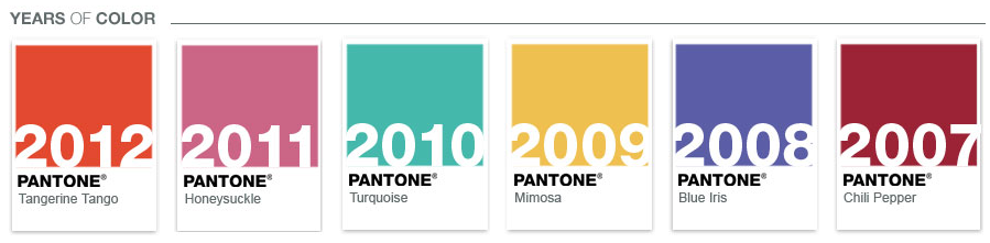
Ever wonder why all of a sudden you see nothing but orange in ads, in stores, when before you didn’t? Get ready, your going to see more. Orange or rather, “Tangerine” was the color forecasted for 2012, with a shelf life throughout 2014. Who says so? Pantone says so!
If you don’t know Pantone, you should! They have been motivating you for years.
Pantone is the foremost authority on color. Not only do they specialize in all aspects of color; textiles, fashion, paint as well as print and graphics; they forecast colors for the future. The PANTONE VIEW Colour Planner is a biannual trend-forecasting tool that offers seasonal color direction and inspiration 24 months in advance for multiple usages, including men’s wear, women's wear, active wear, cosmetics and industrial design.
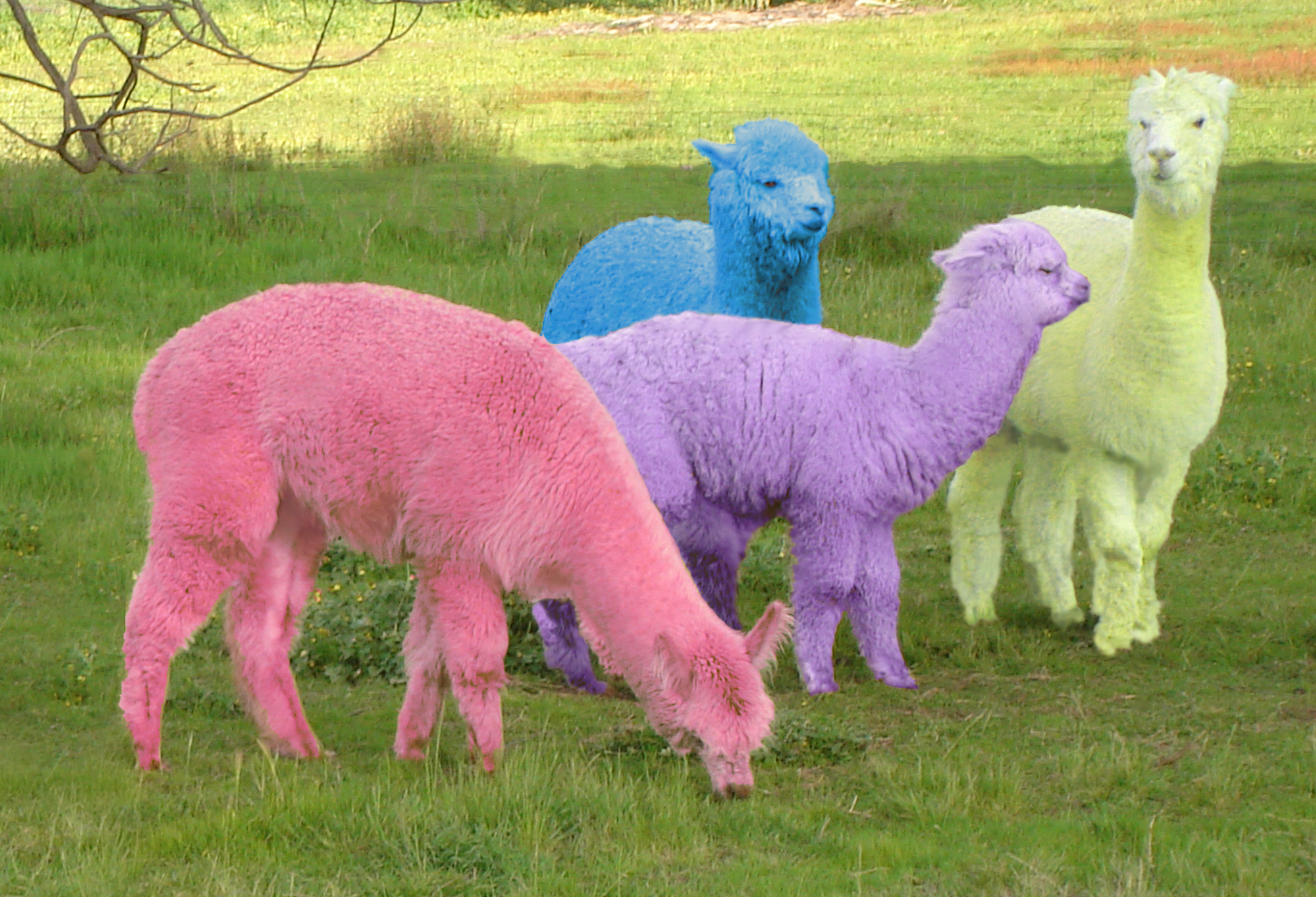
So, knowing this, do we run to the pasture with paint in our hands and start changing the colors of alpacas? No, we don’t have too!
There is a reason 80% of Peru’s population of alpacas is white, it’s because alpaca dyes beautifully and people buy color.
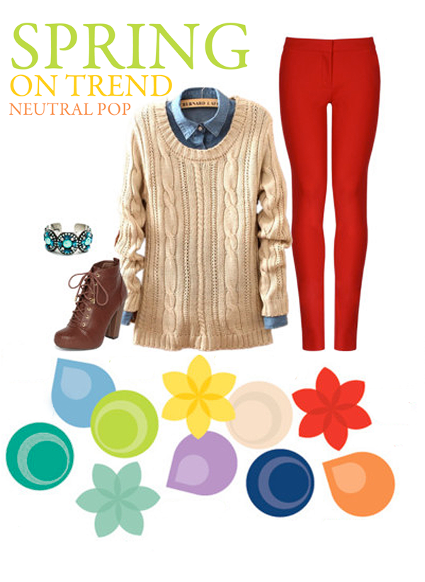
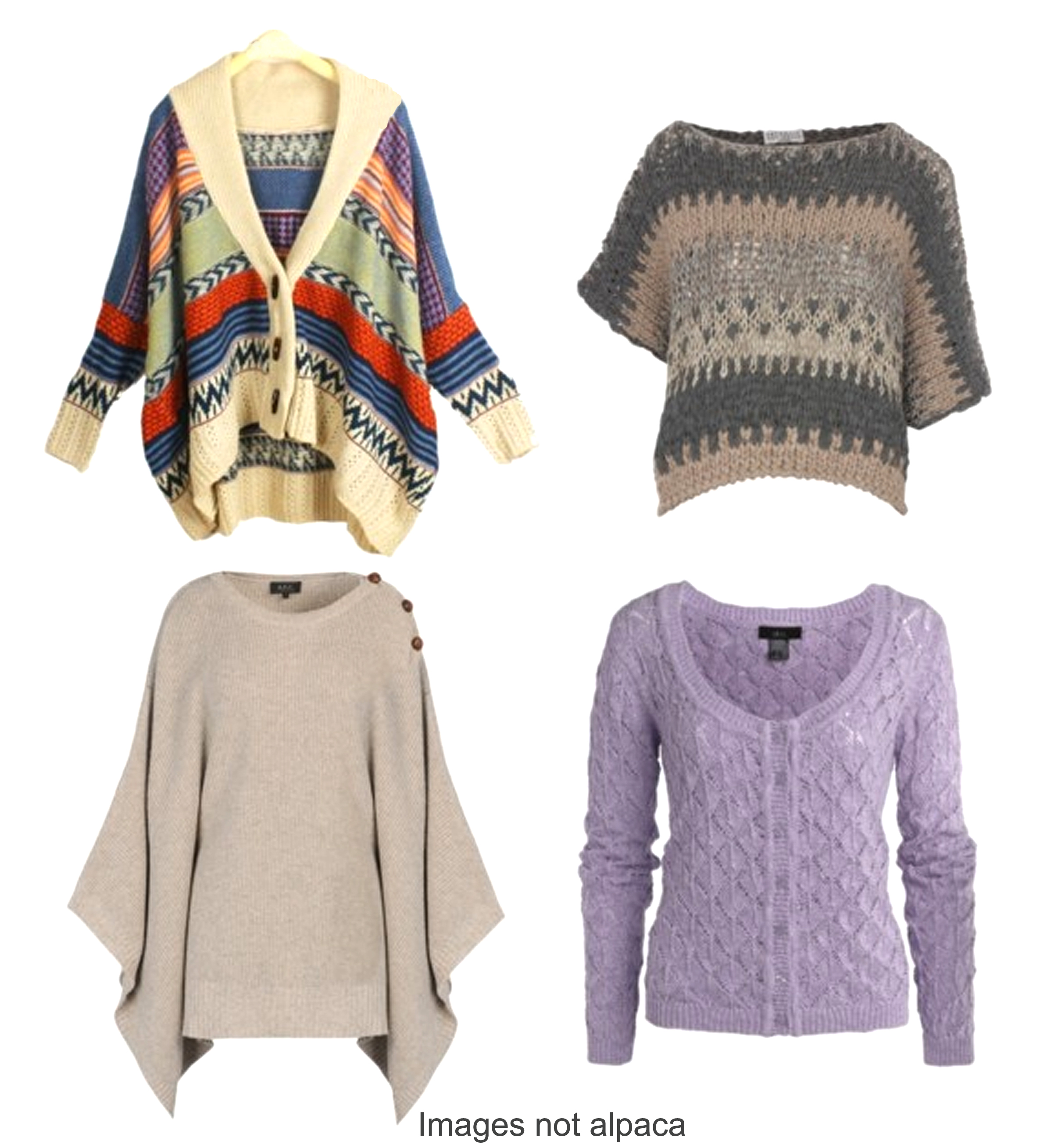
When you are looking for merchandise to put in your store, consider a good mix of multi colored, solid colored and natural shades. The key however, with your neutrals is to make them pop with color!
In painting, neutrals are made by mixing disparate colors together. Mixing red and green paint together will give you a brown, mixing red, yellow, and blue together will push you towards black, and so on. The fact that neutrals actually contain many colors is part of what allows them to look good next to any color.
Set up complete outfits, at least one on a dress form. People have a hard time visualizing what an item, even an item that is right in front of them, will go with. Will it go with the other things they have in their closet? They just don’t know.
Think about the last time you were in a clothing store… did you see the outfits they had on display? They do this so that people get hooked by not only the look, but by the color, and buy the whole outfit. They see the outfit and see it on them.
Everyone has a favorite color, something that they just ooh and ahh over. Studies show this color is formed in childhood. Perhaps it was a room or a chair that gave them comfort or a sibling that they mimicked that instilled the memory; or perhaps it was a compliment “Oh you look so lovely in periwinkle” that stuck (and still lives) in the core of a memory. Most of us loose the connection with the passing of time, but maintain the love for that color and variations there of. One thing is for sure OUR color is rarely any shade of white, brown, gray or black.
I love orange, I know most ladies don’t go for it, but I love, love LOVE it. I have more orange dresses than I can wear at any given time. I just bought another, I HAD to have it. Orange, that’s my hot button.
Pantone has deemed 2013 the year of Emerald. Think about it. How many emerald things do you have in your closet? Not many I bet, because that color hasn’t been featured for many years. Now folks when they see emerald everywhere go, “oh, I don’t have THAT! I need THAT!”
OK, back to the whole outfit. Showcase an outfit, pants, shirt, sweater, scarf, and jewelry. I know, we sell ALPACA, but the other pieces, if done properly will help you sell your alpaca goods. Remember color, pattern, texture and shine; they draw the eye and then people see, actually see, what you are selling. Add a scarf, tuck a pair of gloves in the pocket of the pants, put a pair of socks by the shoes. Your job is to get them thinking, thinking about how they need, and want what they see in front of them.
Don’t just grab a pair of your old jeans, take some time, think about the styles that you see and like today (OK, I know! You spend time in the barn, not at the mall. I get it; I’ve been there. I bet you get magazines, don’t you? Go through them. See the colors and how they put one color with another? Do that! It’s your homework!), then use those ideas, to put your display together. It doesn’t have to be exact, but use it as a general color reference. Use a colorful shirt under the sweater, put on a bangle or a necklace. By making your display similar to what is seen in the marketplace, it instills confidence in the buyer, it is hitting their familiarity and comfort zone.
Make sure you don’t use your favorite shirt or a necklace you love from Aunt Gertrude. If someone wants the whole outfit, sell it to them. Be resourceful. Go to a resale shop and get a few pieces of clothing and jewelry you like, but wouldn’t be sad if someone purchased. Don’t spend a bunch of money, remember this is icing, if it sells great, if not - no big. These are tools as much as a dress form or a table is.
By displaying merchandise in an appealing and orderly fashion, for instance putting similar items in close proximity to each other, your customer will find it easier to shop. This is visual merchandising and it helps the shopper to quickly see product options in a comprehensive way.
Hang a sweater over a shirt, drop on a necklace, and get it up on a wall or at least on a stand, eye level. Folded items rarely get unfolded so people can see the entire piece. Remember mom said, “don’t touch!” this is scorched into our memories and we have to be really, really interested in something before we touch it, pick it up and LOOK at it.
Visual merchandising can give shoppers new ideas by presenting combinations and options. It can give them ideas on how to pare things with the garment you are selling. Your customer will gain insights on how pieces can be matched or mixed to create a working outfit from your, or their, available choices at home.
Effective visual merchandising can create product awareness, boost sales and contribute to the overall effect of shopping in your store. It will draw attention to your loved natural alpaca shades and cause your shopper to not only look and see what you are offering, but realize that for them, the alpaca piece your are selling is to die for.